My opinion on yellow and the Pantone colour of the year 2021
I´ll say it right away. I am NOT usually a fan of yellow. Yellow as in the bright shiny primary colour. I don´t like it. At all.
I´ve always believed it goes back to my family story. I guess it´s the same with every family of four out there, but each of us identified with one of the basic shades: red, blue, green or yellow.
From choosing a colour on our board games to identifying the different toothbrushes. I was always the yellow one. However, for the last few years, my unconscious mind has refused yellow. I guess it’s too loud and aggressive for me to identify with it now. Who knows.
The fact is that I am not a fan, and when I saw the chosen ones for the Pantone Colour of the year 2021, my first thought was: “Ugh, what am I doing with this?”.
I could’ve chosen to ignore it completely, but I believe trends are meant to be surfed and enjoyed.
That’s why I am here, to ride that wave and see how the masters play with it and hopefully they will make me love this loud hue.
Pantone has announced 'PANTONE 17-5104 Ultimate Gray' and 'PANTONE 13-0647 Illuminating' as the 2021 'Pantone Color of the Year.'
The pair have been joined to create an aspirational colour pairing, considering a peaceful thoughtfulness with the optimistic promise of a sunshine filled day.
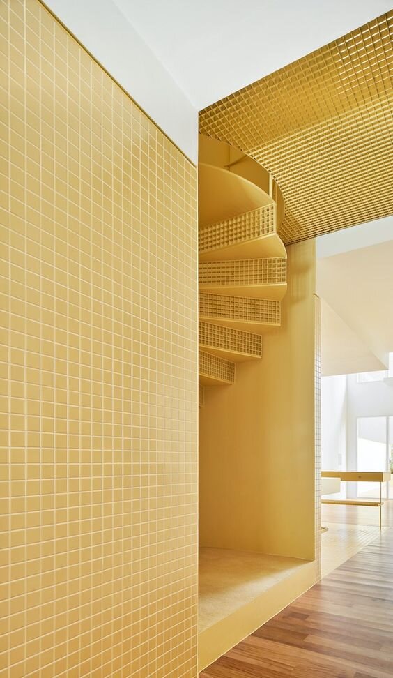
Home in Sant Gervasi, Barcelona, from Arquitectura G.
Photography by Jose Hevia
Home in Sant Gervasi, Barcelona, from Arquitectura G.
Photography by Jose Hevia
If you work on the creative industry, you´ll know that every year brands and companies all over the world try to predict the trends that will be everywhere. Colour companies from their side, chose a shade that suits the year and/or will be everywhere. Pantone is a reference company on its field, and every beginning of December the Pantone Color Institute announces the one that will be the “Pantone Color of the Year”.
As with all trend forecasts, it’s not a flippant decision, they carefully study and consider all the social and artistic movements to have a cohesive proposal. The shade they choose has become more and more popular over the years, and now it’s something that everyone working in the field likes to be informed of.
I don’t know what you’ll think, but I pulled my face when I first saw that this year’s selection was yellow and grey. I thought it wasn´t easily applied to a homey interior. But because I am not easily discouraged I decided to search for some references and that´s what I brought today.
Yellow is optimism and youthfulness, but it also alerts and stimulates the left side of our brain to make quick decisions. It’s perfect for an office or commercial space, but that´s also why it´s difficult for us to use it at home. Nonetheless, its warmer shade -almost mustard- has nearly convinced me. And who knows, maybe I’ll even suggest it in one of my projects, maybe I have in mind a project where it’ll suit perfectly… (It’s only down to the client to accept it 🙃).
Home from Matt Austin. “Double Dolphin Girandole” mirrors from Matt Austin Studio.
Photography by Annie Schlechter.
Courtesy from House&Garden.
Project by Sébastien Caron
Photography by Xavier Béjot
Project by ArchiWisla
Photography by Martina Rudnicka


